The most frequent problem with pictures and logos published at the university is inappropriate use of JPEG images. In particular, we see too many logos and letterheads that get spoilt by JPEG compression.
Here’s an example from outside the university, a logo of the Federació Catalana de Tennis that I received in my email recently.

You will notice that it looks a bit blurry. This is particularly noticeable around the letters on the right.
This problem is an example of inappropriate use of a JPEG file.
Below I try to briefly explain why this has happened.
Let’s start by taking a closer look at the basics of image formats. Suffice it to say:
- High resolution photos occupy a lot of memory and are therefore slow to load over the internet (depending on your connection speed).
- Computer-designed images can be of two main kinds:
- pixel by pixel (called raster): the image is a series of dots
- calculated curves and lines: the image is made up of a combination of mathematical shapes (Bézier curves). These are called vector graphics. Vector graphics have the advantage that they are small files and resize perfectly on screen. The letters of computer fonts are most often vector graphics. No matter how big you make the letters they never look pixelated, getting redrawn at ever greater detail. (We will not discuss vector graphics further here.)
- Because high resolution images occupy so much memory, people often resort to compressed versions of the original images. There are various compressed image formats.
- The important thing to realise is that JPEG/JPG images are compressed in effect by blurring the image at colour boundaries. Because the image is of a natural scene, the observer probably won’t notice the loss of quality. (It’s like seeing natural figures in the clouds!) For the images below, they are gradually more compressed each time and you can get an idea of the compression because I have put the file size below each image.
19.0 kB
4.6 kB

1.4 kB
If you peep at the images through nearly closed eyes, they look the same, I think you’ll agree.
- In contrast, the GIF image format basically compresses images by reducing the number of colours. GIF is a good format for solid colour computer graphics and images with transparent areas.
- The other common compressed format for images is PNG. PNG is good for all kinds of web image.
Coming back to the original problem, the Federació Catalana de Tennis logo looks bad because it has been exported from the original image (in PhotoShop; Illustrator, GIMP, or whatever) into JPEG format, which is not suitable for this kind of image. JPEG is often the default option for image exports. But you need to change it sometimes.
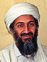
On a related issue, once you have lost image quality by using a compressed format, you cannot get it back from the compressed image, unless you use artificial intelligence and guesswork. This is the stuff of science fiction. You cannot get a sharp image from a blurred image!
Maybe you have seen the 1987 film No Way Out. An important part of the plot revolves around this fanciful idea of trying to add definition to a poor quality image of a criminal caught on camera.
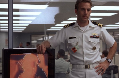
Kevin Costner and who? in No Way Out (Orion Pictures)
For more information about basic image format concepts, consult these pages:
- Image file formats: everything you’ve ever wanted to know, by Samual Lundquist
- Image Editing 101 – Getting Started with Image Editing (Goodwill Communiity Foundation)
- Understanding Image File Formats (TechSmith blog)