In the most recent versions of Moodle, with the Boost theme that we use at UVic-UCC, users see a row of tiles on their Dashboard with links to courses they have entered recently. This is a great usability feature, putting courses that users are currently working on front and centre and making them easy to identify visually.
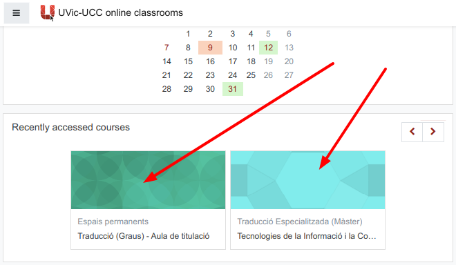
If you don’t configure this image, Moodle puts a neutral mosaic in its place:

It’s easy to change these images and well worth the effort. Use one of your own photos or a photo that is licensed for re-use (e.g. public domain). We recommend you save the image in png format, selecting an area 640 by 400 pixels. This is the recommended image size, which should look good on most screens. (It’s best to avoid text close to the edge of the image, which might be clipped in some views.)
In the silent video below, we show you how to select a free-to-use image at Pixabay.com, crop or resize it at https://pixlr.com/editor/, which is a free online image editor, and publish it as the tile image for your course.
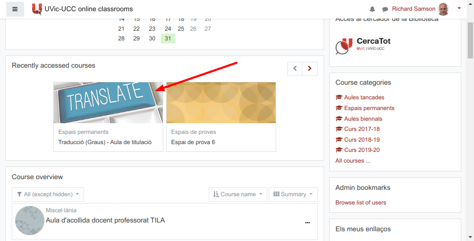
This below is how the course tile looks after the process shown in the video.

If you need help with this process, feel free to consult us at the Teaching Support Unit.

