Malu Calle
Basic plots with R
Some examples in this entry have been adapted from “Producing Simple Graphs with R” by Frank McCown: http://www.harding.edu/fmccown/r/
Generation of random data for the examples
We generate a vector x of 15 values from a normal random distribution with mean=0 and standard deviation=1 and a vector y of 15 values from a normal random distribution with mean=0.2 and standard deviation=1:
set.seed(123)
x<-rnorm(15,0,1)
i<-c(1:15)
set.seed(4)
y<-rnorm(15,0.2,1)
Line charts
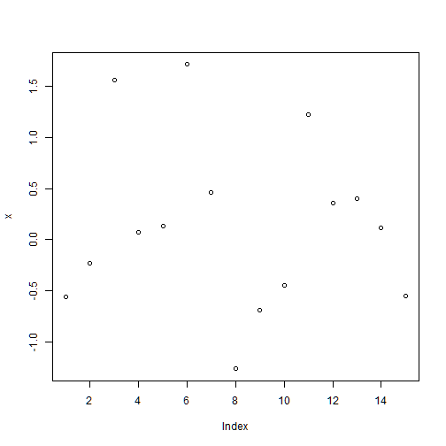
The simplest graphical representation of a numerical variable is the line chart provided by the command plot()
plot(x) #plots the values of x (vertical axis) as a function of the index of each value (horizontal axis)
col: specifies the color of the points
- col=1 black
- col=2 red
- col=3 green
- col=4 blue
- col=5 light blue
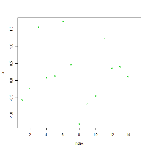
plot(x,col=3) #color=green
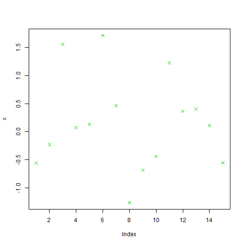
pch: specifies the symbol for the points
pch=1 symbol=cercle
pch=2 symbol=triangle
pch=3 symbol=plus
pch=4 symbol=star
pch=5 symbol=dyamond
plot(x,col=3, pch=4) # color=green, symbol=star
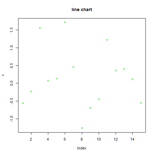
main adds a title to the plot. main is specified within the plot() function
plot(x,col=3, main="line chart") #color=green
title adds a title to the plot. title is specified outside the plot() function
plot(x,col=3)
title("line chart")

type: You can add lines between the points of different types
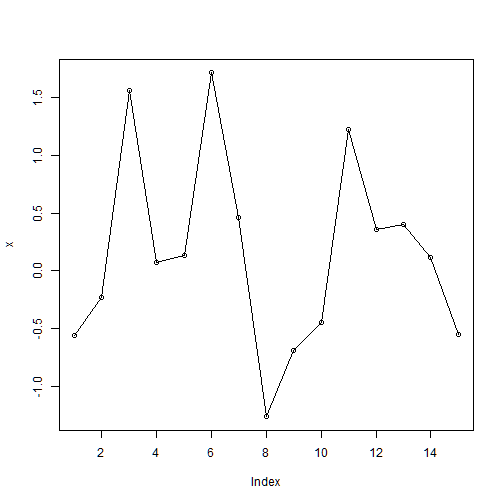
plot(x, type="o") # add lines between points
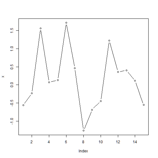
plot(x, type="b") # add lines between points without touching the points
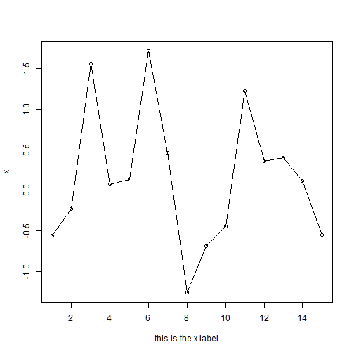
xlab specifies the label of the x axis
plot(x, type="o", xlab="this is the x label")
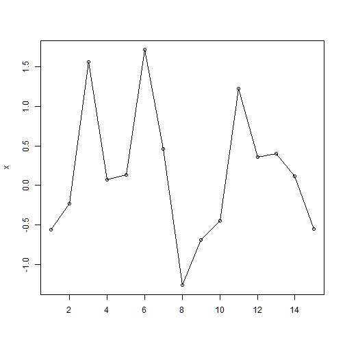
plot(x, type="o", xlab="") # removes the x lable
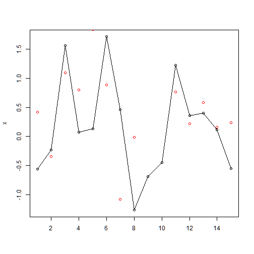
points(): add additional points to an existing plot
plot(x, type="o", xlab="")  # removes the x lable
points(y, col=2)      # add points y in red (col=2)
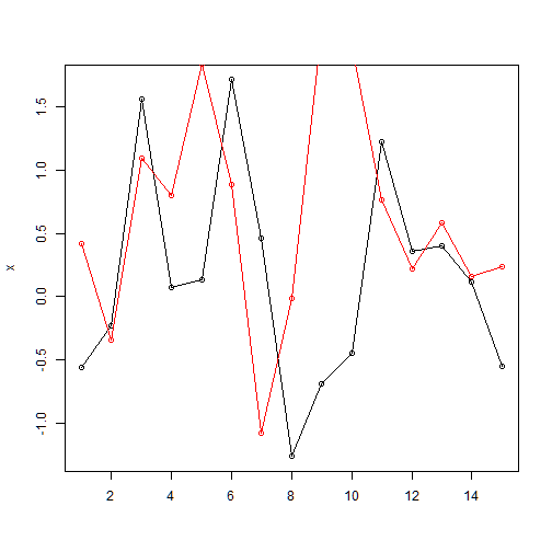
lines(): add points and lines to an existing plot
plot(x, type="o", xlab="")  # removes the x lable
lines(y, type="o", col=2)
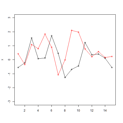
ylim: define the limits of y axis
plot(x, type="o", xlab="", ylim=c(-3, 3))
lines(y, type="o", col=2)
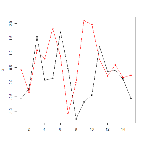
range: range(x,y)=(min(x,y), max(x,y)) among two samples x and y
range(x,y)
## [1] -1.265061 2.096540
plot(x, type="o", xlab="", ylim=range(x,y))
lines(y, type="o", col=2)
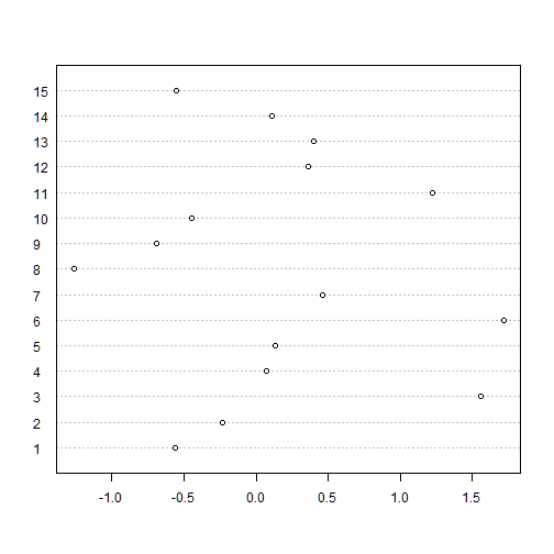
Dot plot
dotchart provides a dot plot of a numerical variable. A dot plot is similar to a line chart but the values of the variable are in the horizontal axis and the indeces in the vertical axis
dotchart(x, labels=i)
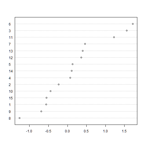
The following dot plot provides a graphical representation of the ranking of variable x
dotchart(x[order(x)], labels=order(x))
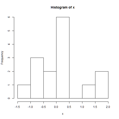
Histograms
hist(): The histogram is one of the main important plots of a numerical variable
hist(x) # title and x label are included by default
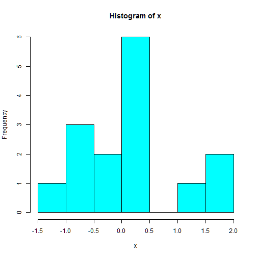
hist(x, col=5)
Boxplot
boxplot()
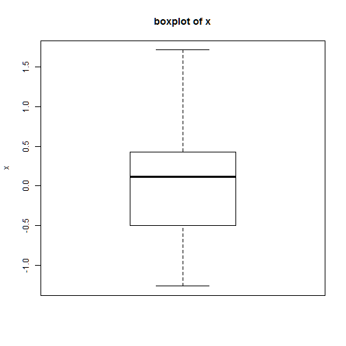
boxplot(x)
title("boxplot of x", ylab="x")
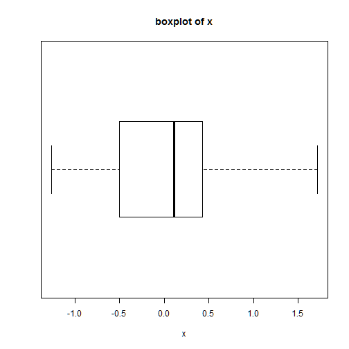
boxplot(x, horizontal=T)
title("boxplot of x", xlab="x")
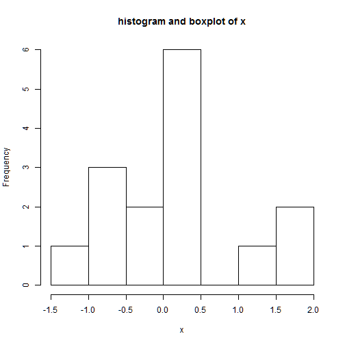
This is an example of a plot containing both a histogram and a boxplot:
hist(x,main='histogram and boxplot of x',xlab='x')
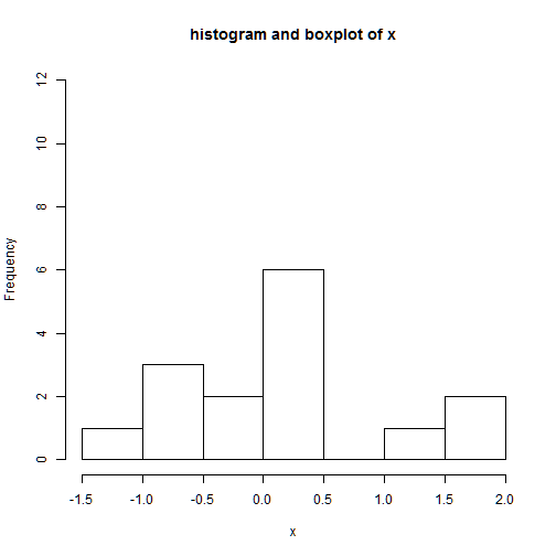
ylim: range of the y axis
we need to extend the y axis in order to make room for the boxplot
hist(x,main='histogram and boxplot of x',xlab='x',ylim=c(0,12))
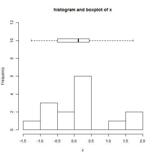
add=T : this allows the addition of the boxplot in the histogram
axes=F: we remove the axes of the boxplot
hist(x,main='histogram and boxplot of x',xlab='x',ylim=c(0,12))
boxplot(x,horizontal=TRUE,at=10,add=TRUE,axes=FALSE)
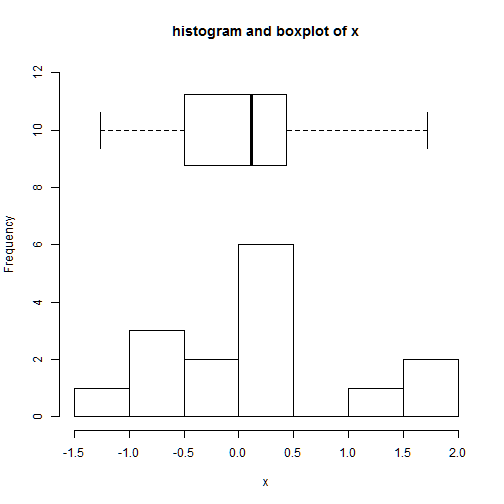
boxwex: specifies the width of the box
hist(x,main='histogram and boxplot of x',xlab='x',ylim=c(0,12))
boxplot(x,horizontal=TRUE,at=10,add=TRUE,axes=FALSE, boxwex = 5)
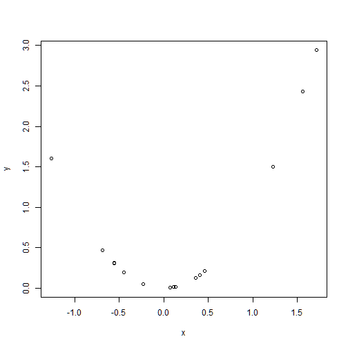
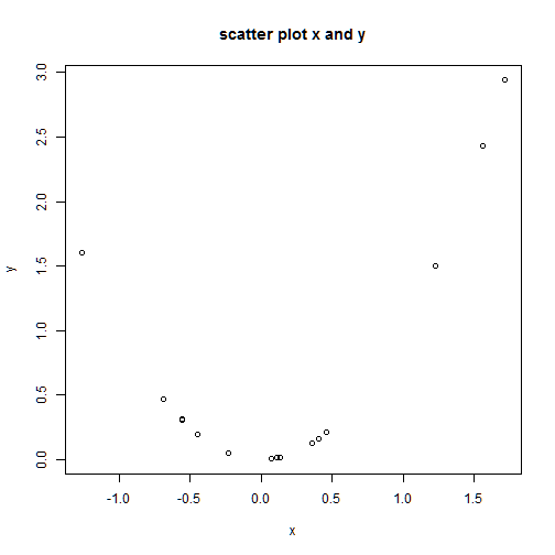
Scatter plots
plot() applied to two variables provides a scatter plot
y<-x^2   # Define y as the squared values of x
plot(x,y)
plot(x,y, main="scatter plot x and y")
Multiple Data Sets on One Plot
points(): add additional points to an existing plot
set.seed(123)
x<-rnorm(15,0,1)
y<-x^2
plot(x,y)

plot(x,y)
x1 <- c(-1,1)  # we add points x=1 and x=-1
y1 <- x1^2
points(x1,y1,col=2)
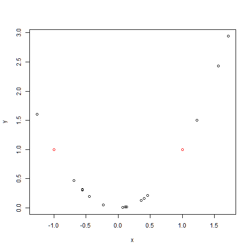
plot(x,y)
points(x1,y1,col=2, pch=3) # symbol=plus

We add lables to the points
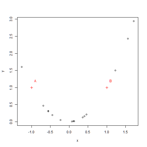
plot(x,y)
points(x1,y1,col=2, pch=3) # symbol=plus
text(x1+0.1, y1+0.2, col=2, c("A", "B"))
plot(x,y)
points(x1,y1,col=2, pch=3) # symbol=plus

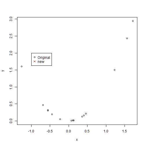
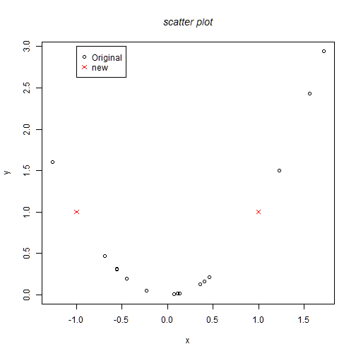
legend: x and y coordinates on the plot to place the legend followed by a list of labels to use
plot(x,y)
legend(-1,2,c("Original","new"),col=c(1,2),pch=c(1,4))
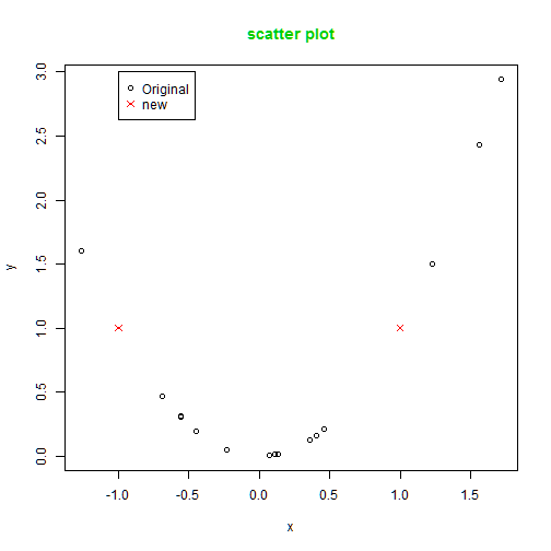
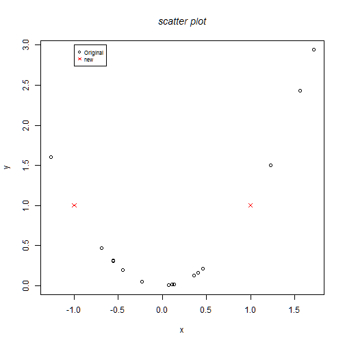
col.main: specifies the color of the title
plot(x,y)
points(x1,y1,col=2, pch=4) # symbol=star
legend(-1,3,c("Original","new"),col=c(1,2),pch=c(1,4))
title("scatter plot", col.main=3)
font.main: specifies the font of the title
plot(x,y)
points(x1,y1,col=2, pch=4) # symbol=star
legend(-1,3,c("Original","new"),col=c(1,2),pch=c(1,4))
title("scatter plot", font.main=3)
cex(): Proportion of reduction or amplification of a font
plot(x,y)
points(x1,y1,col=2, pch=4) # symbol=star
legend(-1,3,c("Original","new"),col=c(1,2),pch=c(1,4), cex=0.7)
#font.main: specifies the font of the title
title("scatter plot", font.main=3)
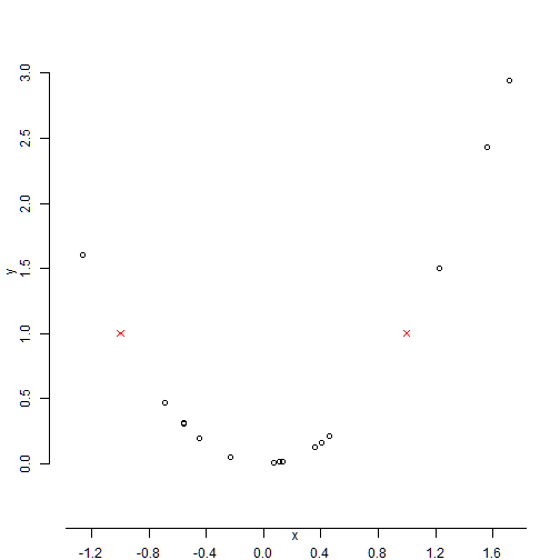
axes=F: remove axes
axis(): define new axes
plot(x,y,axes=FALSE)
points(x1,y1,col=2, pch=4) # symbol=star
axis(1,pos=c(-0.5,0),at=seq(-2,2,by=0.4))
axis(2,pos=c(-1.5,-0.5),at=seq(0,3,by=0.5))
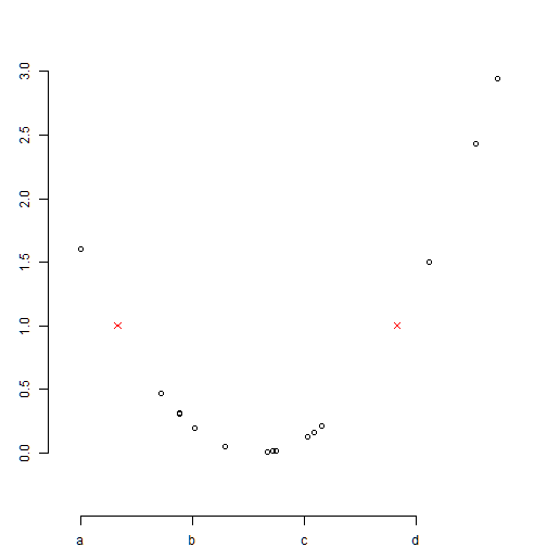
ann=F: removes annotation
lab: define new lables
plot(x,y,axes=FALSE, ann=F)
points(x1,y1,col=2, pch=4) # symbol=star
axis(1,pos=c(-0.5,0),at=seq(min(x),max(x),by=0.8), lab=c("a", "b", "c", "d"))
axis(2,pos=c(-1.5,-0.5),at=seq(0,3,by=0.5))
abline(): abline(a,b) adds line y=a+bx
lty: type of line
plot(x,y,axes=FALSE, ann=F)
points(x1,y1,col=2, pch=4) # symbol=star
axis(1,pos=c(-0.5,0),at=seq(min(x),max(x),by=0.8), lab=c("a", "b", "c", "d"))
axis(2,pos=c(-1.5,-0.5),at=seq(0,3,by=0.5))
abline(1, -0.7, lty=3)
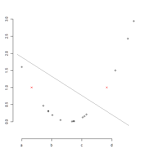
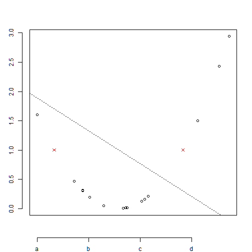
box(): creates a box around the plot
plot(x,y,axes=FALSE, ann=F)
points(x1,y1,col=2, pch=4) # symbol=star
axis(1,pos=c(-0.5,0),at=seq(min(x),max(x),by=0.8), lab=c("a", "b", "c", "d"))
axis(2,pos=c(-1.5,-0.5),at=seq(0,3,by=0.5))
abline(1, -0.7, lty=3)
box()
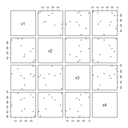
Multiple scatter plots
pairs(): Scatter plots of all pair of variables in a data frame
set.seed(123)
data<-data.frame(x1=runif(10), x2=runif(10), x3=runif(10), x4=runif(10))
pairs(data)
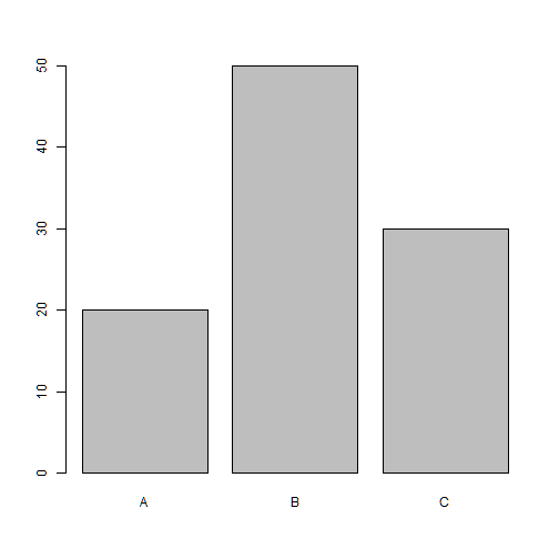
Bar charts
barplot()
group<-c("A","B","C")
freq<-c(20, 50, 30)
barplot(freq)

names.arg
barplot(freq, names.arg=group)
density
barplot(freq, names.arg=group, density=c(5,30,70))
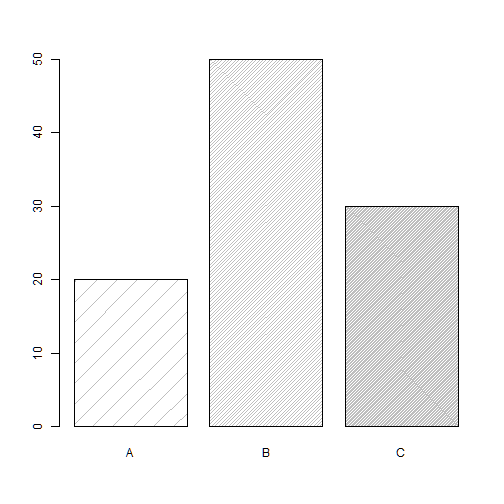
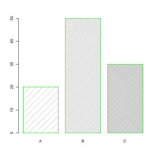
border
barplot(freq, names.arg=group, density=c(5,30,70), border=3)
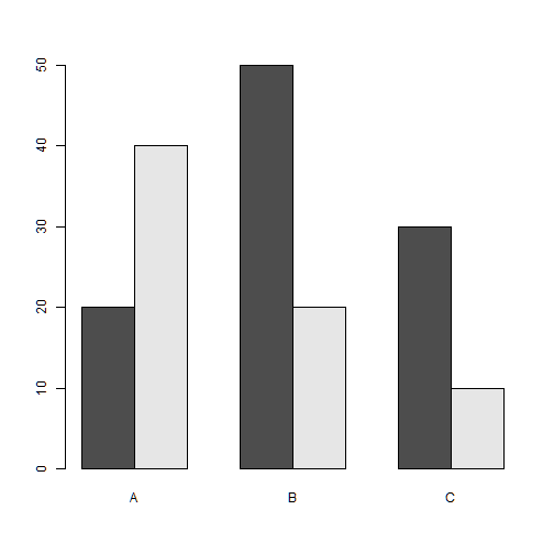
Multiple bar plot
group<-c("A","B","C")
freq1<-c(20, 50, 30)
freq2<-c(40, 20, 10)
freq<-rbind(freq1,freq2)
freq
##       [,1] [,2] [,3]
## freq1   20   50   30
## freq2   40   20   10
names.arg
barplot(freq, names.arg=group)
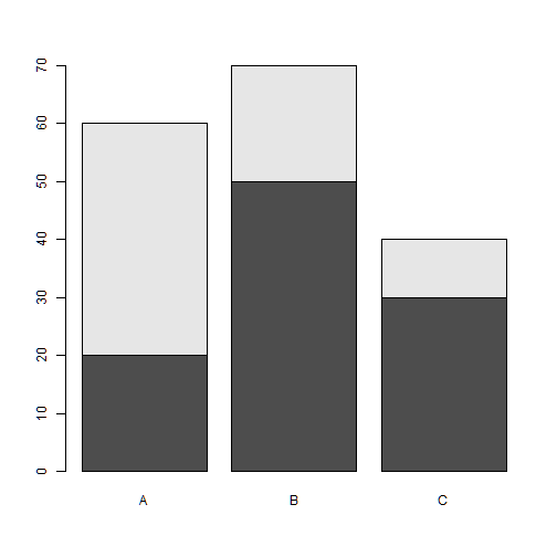
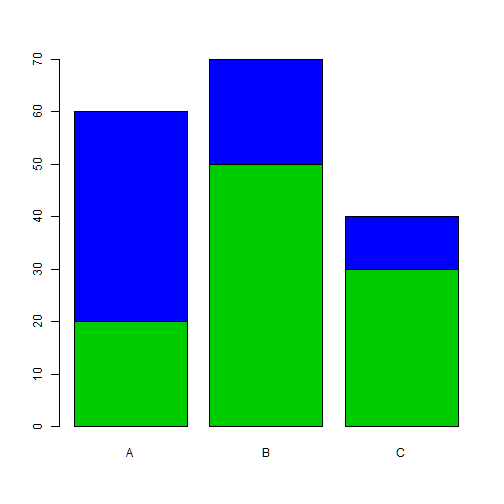
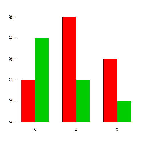
barplot(freq, names.arg=group, col=c(3,4))
beside
barplot(freq, names.arg=group, beside=TRUE)
barplot(freq, names.arg=group, beside=TRUE, col=c(2,3))
Important graphical functions and parameters
par(): set graphical parameters
Before you change the graphical parameters it is convenient to store the default values
defaultpar<-par()
Example:
par(mfrow=c(2,3)) # puts 6 pictures in a plot distributed in 2 rows and 3 columns
hist(data$x1, main="Histogram x1")
hist(data$x2, main="Histogram x2")
hist(data$x3, main="Histogram x3")
boxplot(data$x1, main="Boxplot x1")
boxplot(data$x2, main="Boxplot x2")
boxplot(data$x3, main="Boxplot x3")
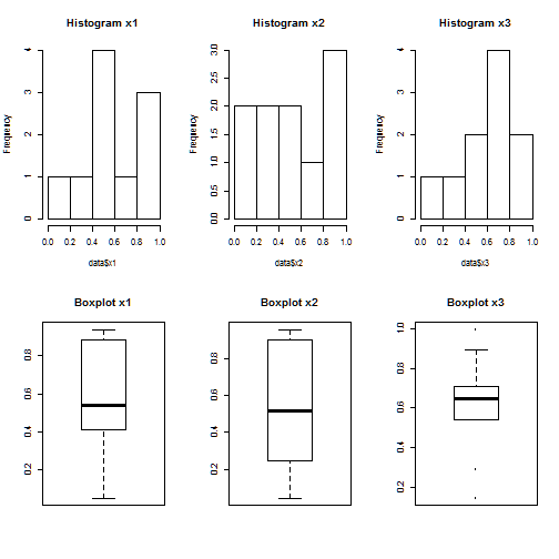
par(defaultpar) # reset the default graphical parameters
Important arguments:
mfrow: number of pictures per row and column in a plot
mar: specifies the margin sizes around the plotting area in order: c(bottom, left, top, right)
col: color of symbols
pch: type of symbols, samples: example(points)
lwd: size of symbols
cex.*: control font sizes
Creating a symbols and color chart
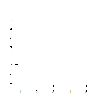
Make an empty chart
plot(1, 1, xlim=c(1,5.5), ylim=c(0,7), type="n", ann=FALSE)
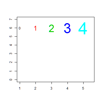
Plot digits 0-4 with increasing size and color
plot(1, 1, xlim=c(1,5.5), ylim=c(0,7), type="n", ann=FALSE)
text(1:5, rep(6,5), labels=c(0:4), cex=1:5, col=1:5)
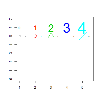
Plot symbols 0-4 with increasing size and color
plot(1, 1, xlim=c(1,5.5), ylim=c(0,7), type="n", ann=FALSE)
text(1:5, rep(6,5), labels=c(0:4), cex=1:5, col=1:5)

points(1:5, rep(5,5), cex=1:5, col=1:5, pch=0:4)
text((1:5)+0.4, rep(5,5), cex=0.6, (0:4))
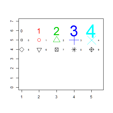
Plot symbols 5-9 with labels
plot(1, 1, xlim=c(1,5.5), ylim=c(0,7), type="n", ann=FALSE)
text(1:5, rep(6,5), labels=c(0:4), cex=1:5, col=1:5)
points(1:5, rep(5,5), cex=1:5, col=1:5, pch=0:4)
text((1:5)+0.4, rep(5,5), cex=0.6, (0:4))

points(1:5, rep(4,5), cex=2, pch=(5:9))
text((1:5)+0.4, rep(4,5), cex=0.6, (5:9))
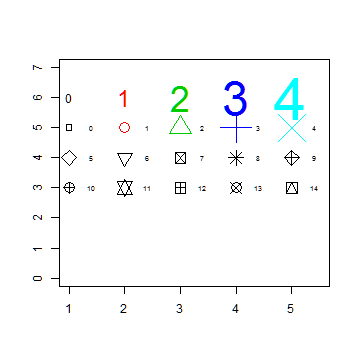
Plot symbols 10-14 with labels
plot(1, 1, xlim=c(1,5.5), ylim=c(0,7), type="n", ann=FALSE)
text(1:5, rep(6,5), labels=c(0:4), cex=1:5, col=1:5)
points(1:5, rep(5,5), cex=1:5, col=1:5, pch=0:4)
text((1:5)+0.4, rep(5,5), cex=0.6, (0:4))
points(1:5, rep(4,5), cex=2, pch=(5:9))
text((1:5)+0.4, rep(4,5), cex=0.6, (5:9))

points(1:5, rep(3,5), cex=2, pch=(10:14))
text((1:5)+0.4, rep(3,5), cex=0.6, (10:14))
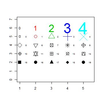
Plot symbols 15-19 with labels
plot(1, 1, xlim=c(1,5.5), ylim=c(0,7), type="n", ann=FALSE)
text(1:5, rep(6,5), labels=c(0:4), cex=1:5, col=1:5)
points(1:5, rep(5,5), cex=1:5, col=1:5, pch=0:4)
text((1:5)+0.4, rep(5,5), cex=0.6, (0:4))
points(1:5, rep(4,5), cex=2, pch=(5:9))
text((1:5)+0.4, rep(4,5), cex=0.6, (5:9))
points(1:5, rep(3,5), cex=2, pch=(10:14))
text((1:5)+0.4, rep(3,5), cex=0.6, (10:14))

points(1:5, rep(2,5), cex=2, pch=(15:19))
text((1:5)+0.4, rep(2,5), cex=0.6, (15:19))
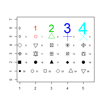
Plot symbols 20-25 with labels
plot(1, 1, xlim=c(1,5.5), ylim=c(0,7), type="n", ann=FALSE)
text(1:5, rep(6,5), labels=c(0:4), cex=1:5, col=1:5)
points(1:5, rep(5,5), cex=1:5, col=1:5, pch=0:4)
text((1:5)+0.4, rep(5,5), cex=0.6, (0:4))
points(1:5, rep(4,5), cex=2, pch=(5:9))
text((1:5)+0.4, rep(4,5), cex=0.6, (5:9))
points(1:5, rep(3,5), cex=2, pch=(10:14))
text((1:5)+0.4, rep(3,5), cex=0.6, (10:14))
points(1:5, rep(2,5), cex=2, pch=(15:19))
text((1:5)+0.4, rep(2,5), cex=0.6, (15:19))

points((1:6)*0.8+0.2, rep(1,6), cex=2, pch=(20:25))
text((1:6)*0.8+0.5, rep(1,6), cex=0.6, (20:25))
Saving Graphics to Files
pdf() redirect the plots to a pdf file. Similarly: jpeg, png, ps, tiff
dev.off() shuts down the specified device
Example:
pdf("color_chart.pdf")  # creates a pdf file containing the following plot, a color chart

plot(1, 1, xlim=c(1,5.5), ylim=c(0,7), type="n", ann=FALSE)
text(1:5, rep(6,5), labels=c(0:4), cex=1:5, col=1:5)
points(1:5, rep(5,5), cex=1:5, col=1:5, pch=0:4)
text((1:5)+0.4, rep(5,5), cex=0.6, (0:4))
points(1:5, rep(4,5), cex=2, pch=(5:9))
text((1:5)+0.4, rep(4,5), cex=0.6, (5:9))
points(1:5, rep(3,5), cex=2, pch=(10:14))
text((1:5)+0.4, rep(3,5), cex=0.6, (10:14))
points(1:5, rep(2,5), cex=2, pch=(15:19))
text((1:5)+0.4, rep(2,5), cex=0.6, (15:19))

points((1:6)*0.8+0.2, rep(1,6), cex=2, pch=(20:25))
text((1:6)*0.8+0.5, rep(1,6), cex=0.6, (20:25))

dev.off()
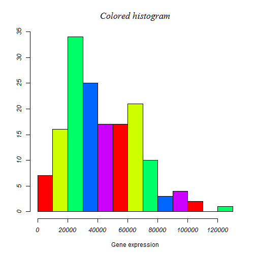
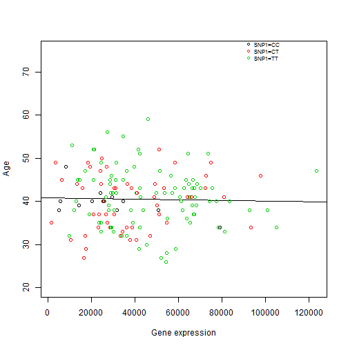
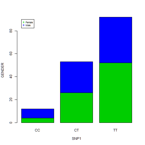
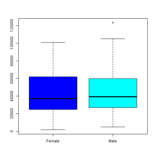
Exercices
Create the following plots with R using data from “SNPdataset.txt”: